The T-Mobile G2 Preview
by Vivek Gowri on October 7, 2010 12:29 PM ESTBefore I actually get to the hinges, let me say that I’m a fan of HTC’s design and engineering team. They put out some of the most consistently well engineered mobile devices, and I’m struggling to remember the last time I was disappointed by the design or build quality of an HTC phone. Whether Windows Mobile or Android, HTC has generally been on top as far as build quality and design goes. Just look at the EVO, the HD2, the Incredible, the Nexus One, or the new Desire HD to see what I mean.
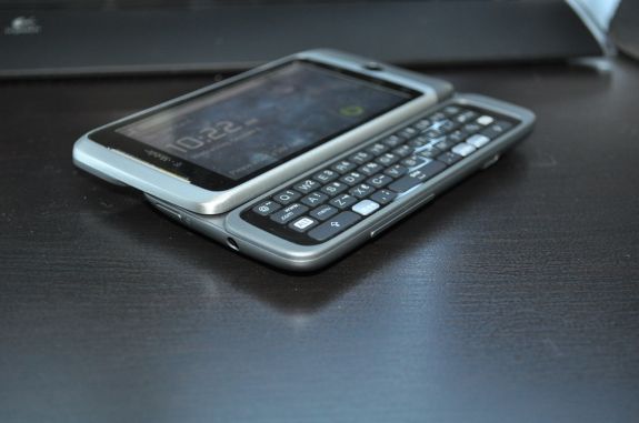
For the most part, the G2 is pretty great and up to the same HTC standard. The top half of the device is mostly constructed of an anodized aluminum, with the bottom edge being done in soft touch plastic. The same soft touch plastic is the primary material for the bottom half of the device, surrounding the keyboard and battery cover. The battery cover itself is rendered in brushed aluminum, with HTC and G2 logos etched in. The entire package is very solid as expected, and the level of attention to detail paid here is so high that there’s even a spring-loaded release switch for the battery door. This is stuff that normal handset makers don’t even dream about (Samsung, I’m looking straight at you. I was certain that the Fascinate’s back cover was going to snap the one time I tried to take it off). HTC's usual attention to design makes that “Z” hinge all the more perplexing.
Note the usage of the word hinge. Most landscape QWERTY devices use a slider - pretty simple stuff, just a set of rails on the back side of the screen and a set of protruding runners above the keyboard. You might find a spring attached to make the motion of the screen smoother and ensure the screen stays open or closed, though this depends on how much space there is (for example, the super-thin Droid and Droid 2 forgo the spring-loaded mechanism). Now the G1 had a funky, curved hinge that basically acted as a slider, since the motion was in the same plane as the screen (there was also an arced track/runner system on the left side of the device.) This time around though, HTC has one upped themselves and made that hinge act perpendicularly to the plane of the screen.
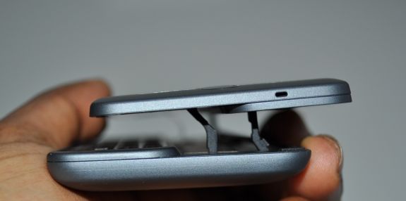
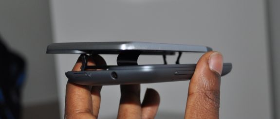
What this means is that instead of a curved slider like the G1, the G2’s screen actually travels in a semicircular arc in the process of “sliding” up, hoisting itself above the body and then coming back down to reveal the keyboard. It’s a pretty neat trick, seeing the screen a centimeter above the body, until it hits you - the only thing holding the screen and the body together at that point are three plastic posts that are about 1 mm^2 in cross sectional area, and an exposed ribbon cable. Oh God.
What makes this even more concerning is that HTC is having some early run quality control issues with the G2. Among the laundry list of common issues is that on some devices, the hinges are loose. For example, if one were to hold the phone upside down, the screen would fall open. As luck would have it, my unit was one of them. The looseness of the springs and the overall lifelessness of the mechanism probably is contributing to my paranoia about the hinges, but I have played with another G2 that did have properly working hinges and while the hinge did feel more robust, it certainly did not feel sturdy. I’d be interested to see how much fatigue testing HTC did before finalizing this hinge design for production, since the “pop hinge” (their term, not mine) seems like a pretty large Achilles’ heel for an otherwise excellent design.


59 Comments
View All Comments
Ambictus - Thursday, October 7, 2010 - link
"the first HTC GSM Android device (since the Nexus One)"Actually the HTC Aria was released in June on AT&T.
ImSpartacus - Thursday, October 7, 2010 - link
I think we are to assume that such statements are limited to tier 1 phones. In if it doesn't cost $200, it doesn't count.Good catch though, I'm sure Gowri will respond with a proper answer soon.
VivekGowri - Thursday, October 7, 2010 - link
Good catch, I completely forgot about the Aria. Nothing against it, it's a nice little phone, but it's not a real high end Android device (which is what I was thinking about when I wrote that). ImSpartacus was right, I was basically just looking at the so-called "superphones".Goi - Wednesday, October 20, 2010 - link
Then there's also the HTC Desire...SDentertainmnt - Thursday, October 7, 2010 - link
"As the first GSM Android device with a keyboard (since the G1)"I Believe the Tmobile MyTouch Slide fits that description and has been out for months now :)
VivekGowri - Thursday, October 7, 2010 - link
I just got owned. Thanks for catching my mistakes you guys! :)vol7ron - Thursday, October 7, 2010 - link
You could replace the phrase, "the first device since..." with, "since ... there haven't been too many other (if any) devices that..." and fix all your mistakes in one swoop :)ImSpartacus - Thursday, October 7, 2010 - link
When the Engadgets of the world are all posting their G2 REviews, AT is posting its PREview.I <3 Anandtech's thoroughness.
mino - Thursday, October 7, 2010 - link
Actually, considering that the mass-produced units may have a bunch of the issues taken care of there is nothing wrong about it.Not forgetting that an AT "Preview" usually has about as much useful data in as an Average "Review" ... It is not hard to churn out 20 pages of spin.
To me it seems a limited amount of AT man-hours along with probable-to-be-corrected-soon type of device is the reason.
vol7ron - Thursday, October 7, 2010 - link
I think he was saying that AT takes the time to do the reviews right?